Product Updates, Reimagined

Exploring ways to improve feature awareness through thoughtful UX ans visual storytelling

Role

Product Designer

Industry

FinTech

Business Model

B2C

Timeline

3 week-sprint

Collaborators

Profile portrait of a man in a grey shirt

What's New Section

What's New Section

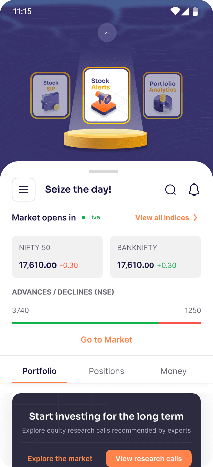
Many users were not aware of the new features and enhancements introduced in the app, which led to low adoption and underutilization of key updates. To address this, the goal was to increase awareness and engagement by making these updates more visible and interactive. The proposed solution was to introduce a dedicated “Story Section”, an engaging, scrollable format that highlights new updates in a simple, visually appealing way, ensuring users notice and explore them.

Concept Ideations

Concept Ideations

For the “What’s New” feature, I went through multiple rounds of ideation and brainstorming to explore different ways of presenting app updates effectively. The focus was on making the section engaging yet intuitive, ensuring users could easily discover new features without disrupting their overall experience.

For the “What’s New” feature, I went through multiple rounds of ideation and brainstorming to explore different ways of presenting app updates effectively. The focus was on making the section engaging yet intuitive, ensuring users could easily discover new features without disrupting their overall experience.

Ideation 1-closed

Ideation 1-closed

Ideation 1- open

Ideation 1- open

Ideation 2

Ideation 2

Story Visual Ideation 1

Story Visual Ideation 1

Story Visual Ideation 2

Story Visual Ideation 2

Story Visual Ideation 3

Story Visual Ideation 3

Final Ideations

Final Ideations

1st Finalised Design

1st Finalised Design

The first design for “What’s New” was a highlighted story section with a background featuring an ocean view inspired by Ventura’s lighthouse logo, symbolizing guidance and visibility for new features.

The first design for “What’s New” was a highlighted story section with a background featuring an ocean view inspired by Ventura’s lighthouse logo, symbolizing guidance and visibility for new features.

Finalised Story Visual

Finalised Story Visual

The story format was designed to depict the steps of using new features in a simple, visual way, making it easier for users to understand and explore them.

The story format was designed to depict the steps of using new features in a simple, visual way, making it easier for users to understand and explore them.

What's New Web

Redesigned Version

Redesigned Version

The “What’s New” section was later redesigned to align with Ventura’s new design system, adopting a simpler layout that utilized space more efficiently. Unlike the first design, where a prominent area was dedicated to it, the new version integrated updates in a subtle way without disturbing the overall app design.

The “What’s New” section was later redesigned to align with Ventura’s new design system, adopting a simpler layout that utilized space more efficiently. Unlike the first design, where a prominent area was dedicated to it, the new version integrated updates in a subtle way without disturbing the overall app design.

Always in motion, making things, breaking things, and talking about things that don’t exist yet.

tanayavnaik55@gmail.com

Copied

©2026

Profile portrait of a man in a grey shirt
[tanaya naik]

Always in motion, making things, breaking things, and talking about things that don’t exist yet.

tanayavnaik55@gmail.com

Copied

©2026

Profile portrait of a man in a grey shirt
[tanaya naik]

Always in motion, making things, breaking things, and talking about things that don’t exist yet.

tanayavnaik55@gmail.com

Copied

©2026

Profile portrait of a man in a grey shirt
[tanaya naik]

Create a free website with Framer, the website builder loved by startups, designers and agencies.